Behind the Label with… The Brewing Project
You know what’s in your beer. Now, learn about what’s on it.
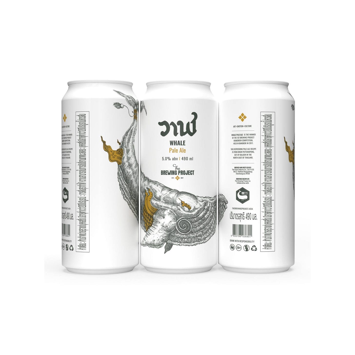
Look closely: the award-winning Whale Pale Ale label has lots of clever touches. / Image courtesy of the Brewing Project
It’s hard to say exactly when, but sometime over the last decade, beer fridges started to become something akin to glass-encased art galleries.
Where they once featured rows of silver bullets, bald eagles, and basic palettes, they suddenly transformed into multidimensional displays of color and imagery.
Obviously, economic reasons have largely driven the evolution of beer labels. If your product sticks out, consumers are more likely to reach for it. Several people I know, including my wife, gravitate toward certain products because of their labels. We eat with our eyes, after all. It stands to reason we might drink with them, too.
But beer art does much more than just build brand awareness.
Great labels signal flavor profiles, styles, the ethos of the people making your beer, and sometimes much more. They’re also a really great way to support local artists and remind consumers that beer-making is also a creative pursuit.
Enter Behind the Label. For this series, I’ll be talking to artists, designers, and brewers in Thailand about the inspiration behind their beer labels, exploring small details you may have missed, and digging into how their art defines who they are.
First up: The Brewing Project.
Bill and the Whale: A deep dive into brand identity
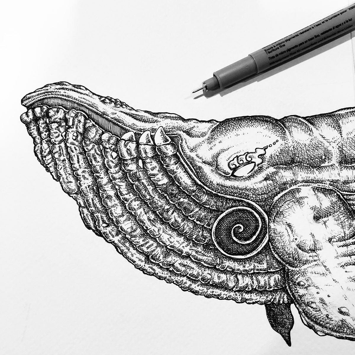
It started out with a fish, how did it end up like this? / Image courtesy of the Brewing Project
As the name suggests, the Brewing Project began as an experiment.
Beervana co-founder Brian Bartusch says he and fellow co-founder Aaron Grieser had hoped to start a brewery in Thailand. For reasons that should be clear, that wasn’t easy. Instead, they established Beervana to import and distribute great beer, but they never stopped dreaming of making their own.
In 2017, Beervana held an open competition for homebrewers—a first step toward realizing that dream.
The winner, a man known as Pong, was a surprise to most, according to Bartusch. Most in attendance were graduates of Wichit “Chit” Saiklao’s influential Chit Beer homebrewing academy, and any one of them may have been the favorite to win.
“Pong was unknown to the whole competition. He was brewing by himself up in Kalasin [a province in northeastern Thailand],” Bartusch says. But he wowed the judges with a clean, crisp pale ale he dubbed “Whale.”
Why Whale, you ask? Pong was a civil servant who worked on water resource issues, and “I think he was just really into whales at the time,” Bartusch wagers.
When it was time to create a label for the beer, Beervana’s resident art director, Tharatip “Bill” Thongchaiyaphum, found a narrative in Pong’s solo endeavor, as well as his affinity for whales, and ran with it.
The beer was bumped up to 5.2% ABV and 52 IBU in honor of the “Loneliest Whale”—a creature who sings at 52 hertz, a frequency that, legend has it, no other whale can understand. (It has since been brought down to 5.0% ABV and an IBU “in the 30s” for a more balanced beer, according to Bartusch.)
While Whale Pale Ale’s story was clear, the brand identity was still a blank slate. As it happens, Bill had ideas to fill it. Once they were set in motion, the Brewing Project started to take off.
The font, the logo, and Easter eggs
The original design featured several hidden messages. / Image courtesy of the Brewing Project
First, Bill turned to Sangchai “Pingpong” Pangnum—Beervana’s designer at the time—to help bring the branding to life.
The typeface Bill envisioned would feature a curling, cursive-like font for “The” and a bolder, soft-edged font for “Brewing Project”—something older and elegant complemented by a sleeker, contemporary font. “Whale,” meanwhile, would be refined and quintessentially Thai. In fact, it’s written in Thai: วาฬ, pronounced “wan.”
“We wanted about a 50-50 mix of modern and traditional Thai art,” Bill explains. “Now, it’s evolved to be a little more modern than traditional.”
He also wanted to make an icon to pair with the text—a thread that would unite all future Brewing Project beers. While it’s far from the first image you see, this little symbol has a remarkably complex backstory that speaks to the attention to detail the Beervana team have put into the Brewing Project.
Bill and Pingpong began with the image of a hop, looked at it from a top-down view, and then got granular with it. Eventually, they trimmed the parts of the hop down to just four—two spade-shaped pixels, if you will, and two more fluid, softer-edged pixels. It looks a bit like a diamond or deconstructed flower petal, but it’s neither.
“The shape of it recalls the thaprajamyam (ตราประจำยาม),” Bill explains, referring to the symbolic seals that Thai Buddhists put above their doors or on the headliners of their cars for good luck. “We also wanted it to look like gold leaf [like we use at temples].”
This icon can be found on the front and back of the Brewing Project’s beer cans and bottles. Although Bill admits no one has identified it as hops, let alone a nod to a traditional Thai symbol, he points out that it nevertheless attracts your attention.
On every label Bill designs now, this icon changes according to the accent color chosen for the beer. For example, for the recently made Aran—a wood-aged pilsner made in collaboration with Far Yeast in Japan, part of a series uniting Thai brewers with the Brewing Project and Beervana’s partners—it pops in a shimmering sky blue, embellished with the use of foil in the printing process.
For the image of the whale, Bill went even deeper. He let Pingpong get creative, too.
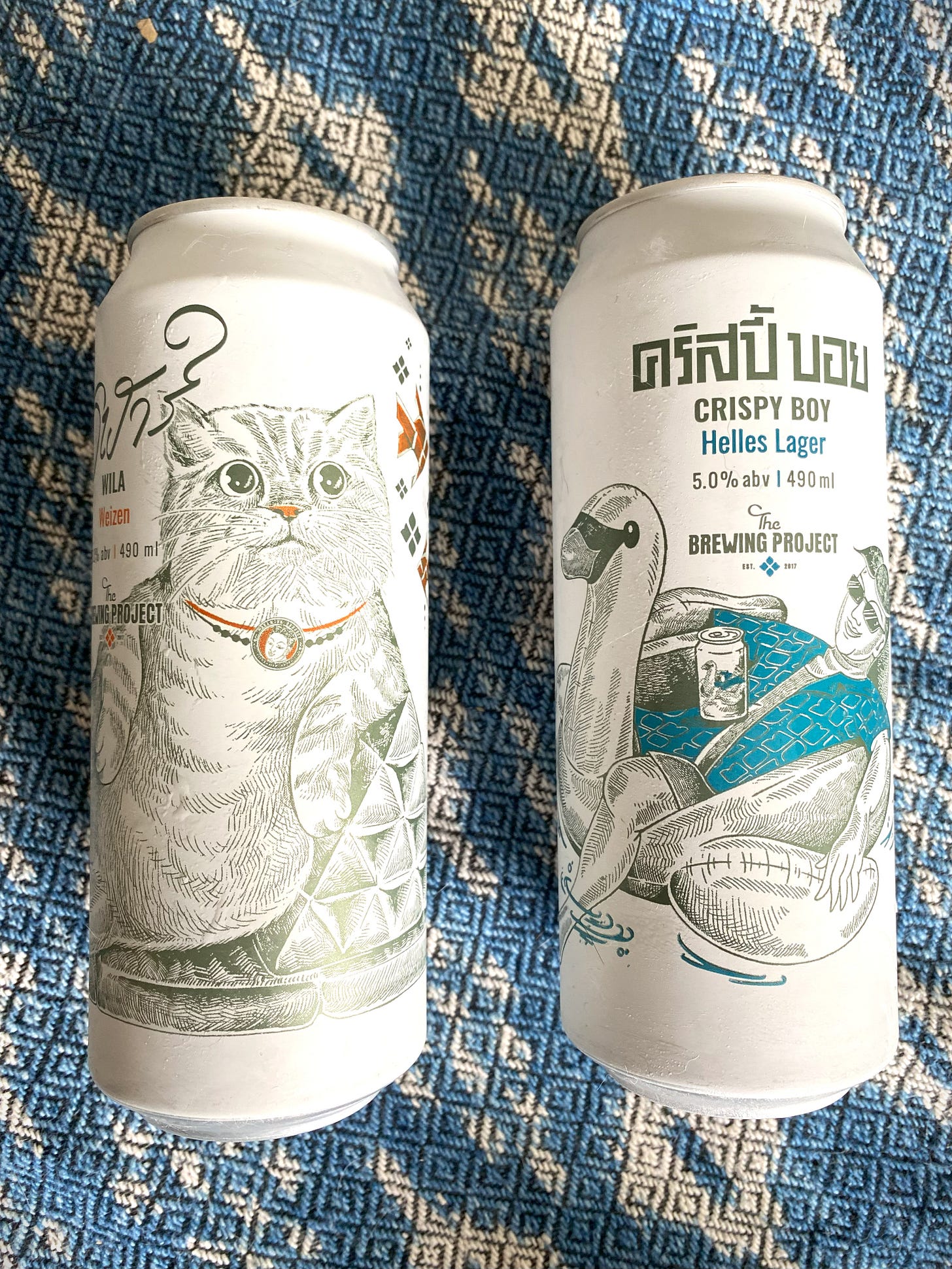
The work Pingpong produced recalls the refined, hyper-detailed imagery you’d find in Thai temple art. That’s most obvious in the male character—the same you see in the necklace the cat wears on their Wila Weizen and floating on cans of Crispy Boy (and on the can within the can—look closely).
The can within the can (within the can?)
The original Whale label featured this beer-loving bro, the brand’s de facto mascot, swimming alongside one of the whale’s fins that was drawn to evoke an elephant’s ear. While they removed the mascot from Whale a couple of years ago, he still appears on most Brewing Project beer labels.
But wait, there’s more! The joint of the whale fin also featured a curlicue in the shape of the Thai number one—a subtle note celebrating Whale as the first beer to emerge from the Brewing Project. And, of course, gold accents contrast with the inky hue of the whale’s body, which was drawn in fine-tipped pen.
The whale wraps across a clean white can, requiring you to turn it to take in the detail. Or, as is the trend in the U.S., if you buy three cans, you can line them up and see it as one connected design.
It’s toned down yet memorable—exactly what the Brewing Project was going for.
“So many beer labels today are bright and noisy. We wanted something clean and neutral [that would stand out],” Bartusch notes, singling out Maine Beer Company and Kagua as inspiration.
Beer cans as statement pieces
For the Brewing Project’s first two beers—Whale Pale Ale and Raven IPA—Pingpong created the artwork. As the Brewing Project has expanded its output, Bill has looked deeper in his rolodex to find new and emerging artists.
He commissioned a different artist for two of the Brewing Project’s four core beers, Crispy Boy Lager and Wila Weizen, both brewed at Thai Spirit Industry (TSI) and sold in 490ml cans. And now he plans to work with a different artist for each of ongoing collaboration series, most of which are being brewed at Brewlander in Singapore.
Wila and Crispy Boy: two easy-drinking beers ideal for sunny days. Also note the meta-mascot and hop-derived icon.
“Beer is not just beer. We can build the creative community with it, too,” Bill says.
For every project, Bill gives artists few parameters. Just add their stamp based on the aesthetic Pingpong helped create—one that powered the Brewing Project to a Demark Award for packaging design this year. (The award is handed out by Thailand’s Department of International Trade and Promotion to brands and individuals who are raising the bar for Thai products. The win, at least to me, was something of a surprise, considering alcohol is such a taboo topic for Thai bureaucrats.)
One thing that won’t change, however, is Bill’s thirst for a good narrative.
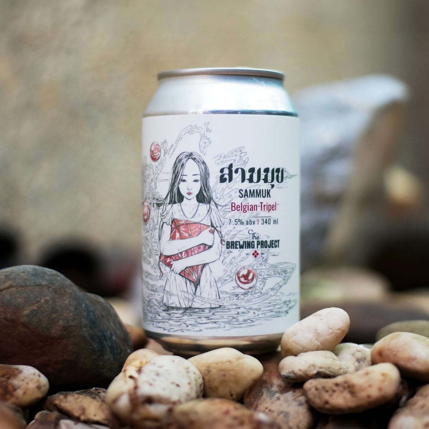
For Sammuk, a malty, rich, and ridiculously tasty 7.5% Belgian-style tripel brewed in collaboration with Bang Saen-based Triple Pearl, he drew on a local legend about a poor woman and wealthy man who leapt off a cliff because they couldn’t be together. “Like a Thai Romeo and Juliet,” Bartusch says.
Sammuk, a Belgian-style tripel brewed Triple Pearl. / Image courtesy of the Brewing Project
On the label, you’ll spot three red pearls (Sammuk translates to “three pearls,” a.k.a. Triple Pearl) amongst the anime-like figure of a woman rendered in pen strokes.
For Yaksa, a 4.8% session IPA made with Yaksa Brewery, the label again speaks to the partner brewery’s name—yaksa is a mythical Thai giant—but it also makes subtle political statements.
On the can, a human emerges from beneath the giant’s mask as he rises up from the ground; one of his arms is tied down, and there are scars on his face.
“It’s showing that there’s a human behind the beer,” a nod to the political games and laws that limit brewing in Thailand, Bill says.
Note the scars, the arm rooted to the ground. / Image courtesy of the Brewing Project
The message echoes Yaksa’s own story.
Yaksa was a fixture on the Thai beer scene for many years, but it disappeared as brewing became increasingly difficult and politically charged. Thanks to this collaboration with the Brewing Project, Yaksa is now returning to the fold.
As Bill says, beer really is more than just beer. With its beer labels, the Brewing Project has managed to create something aesthetically pleasing and culturally important. The artwork in many ways could help elevate the Thai craft movement.


